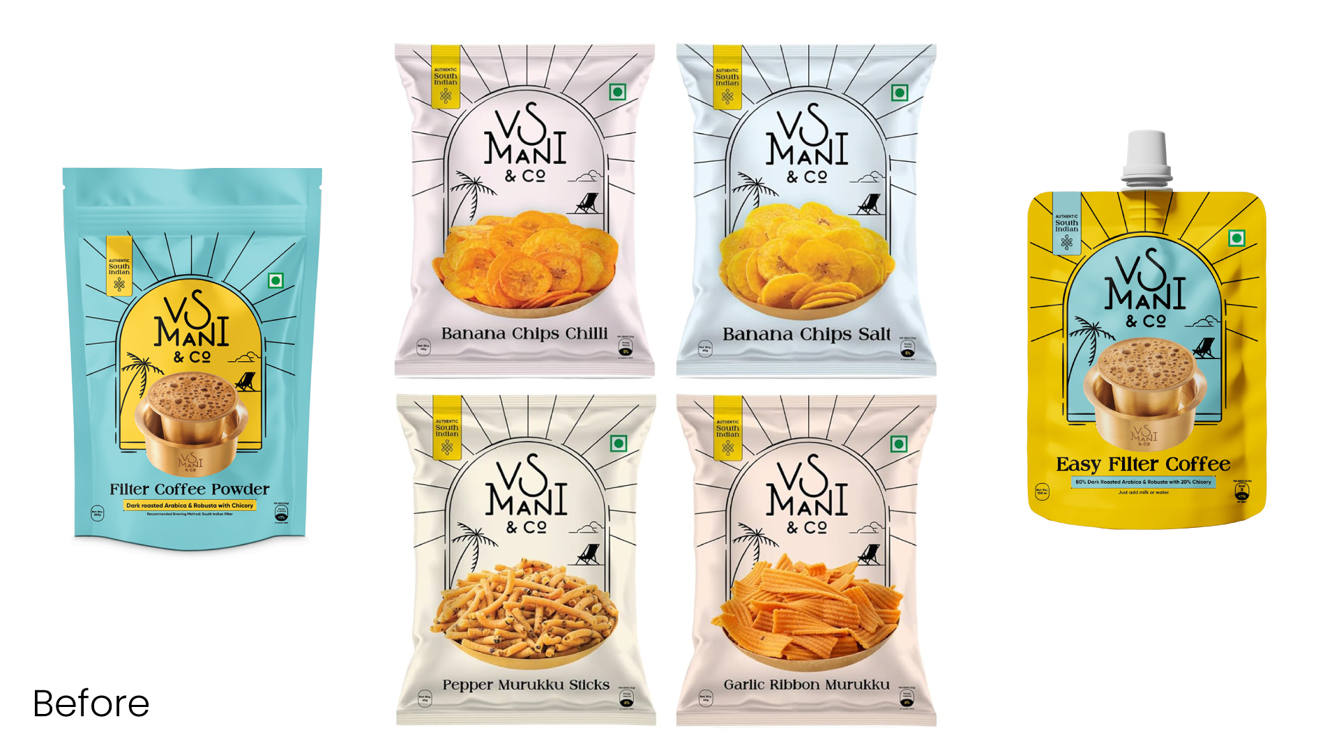
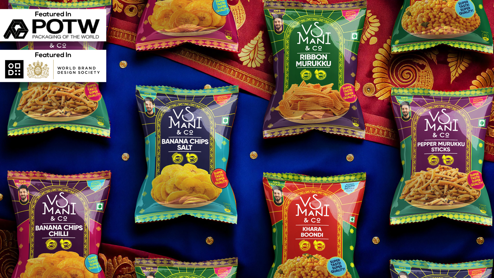
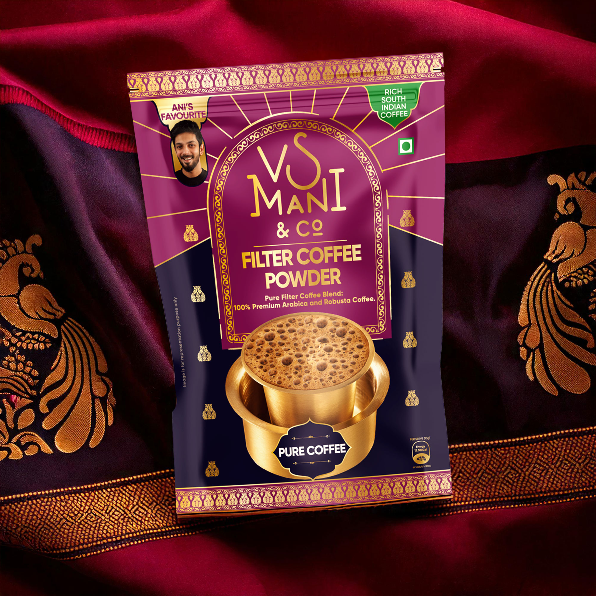
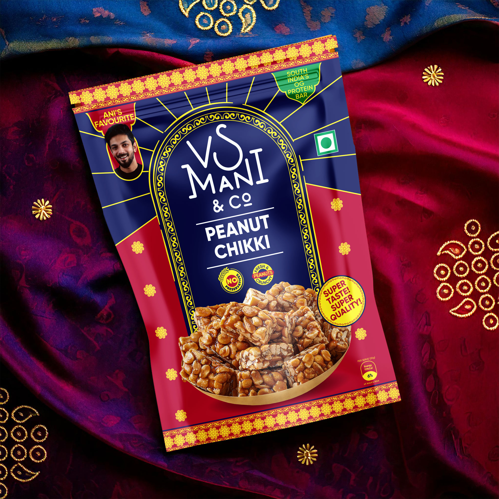
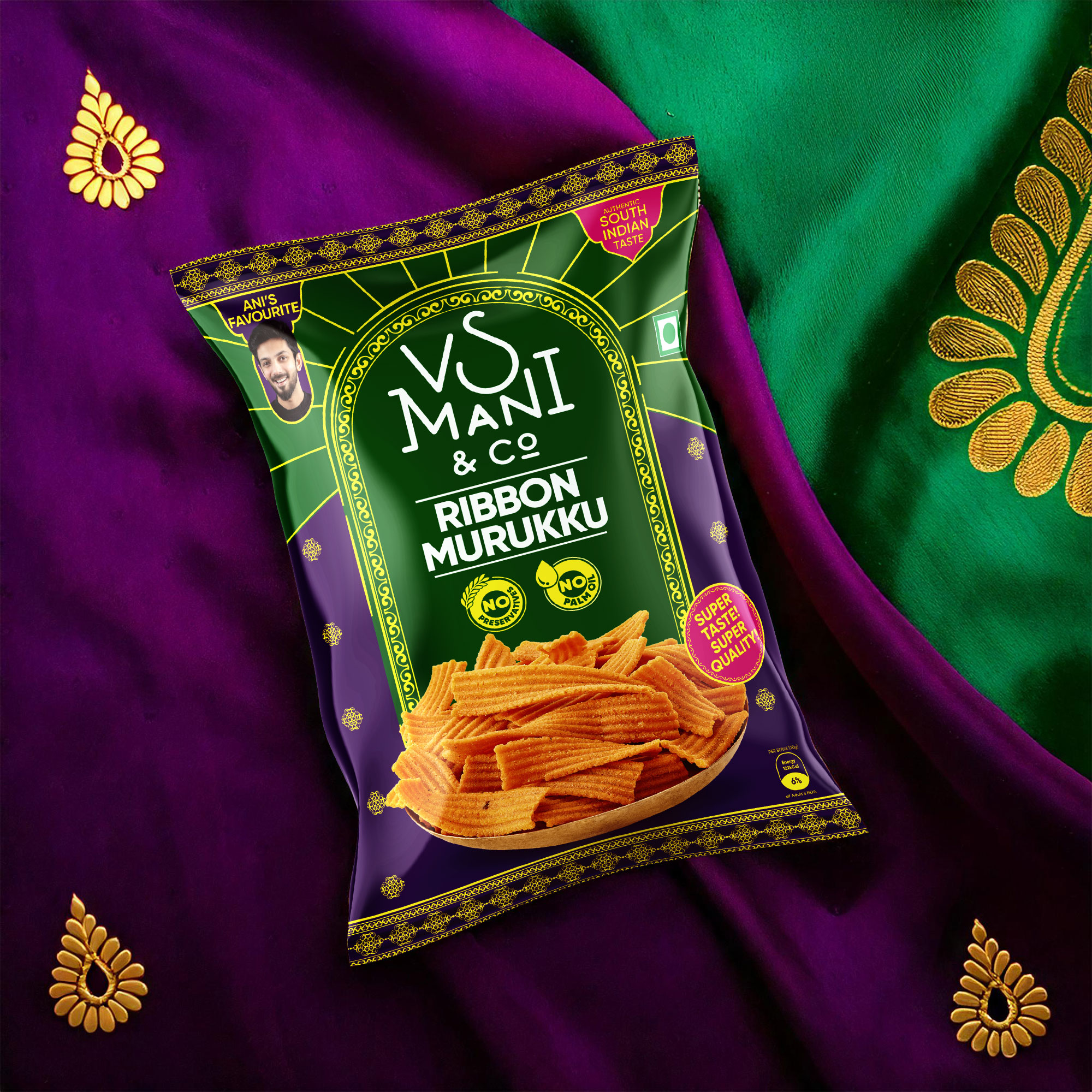
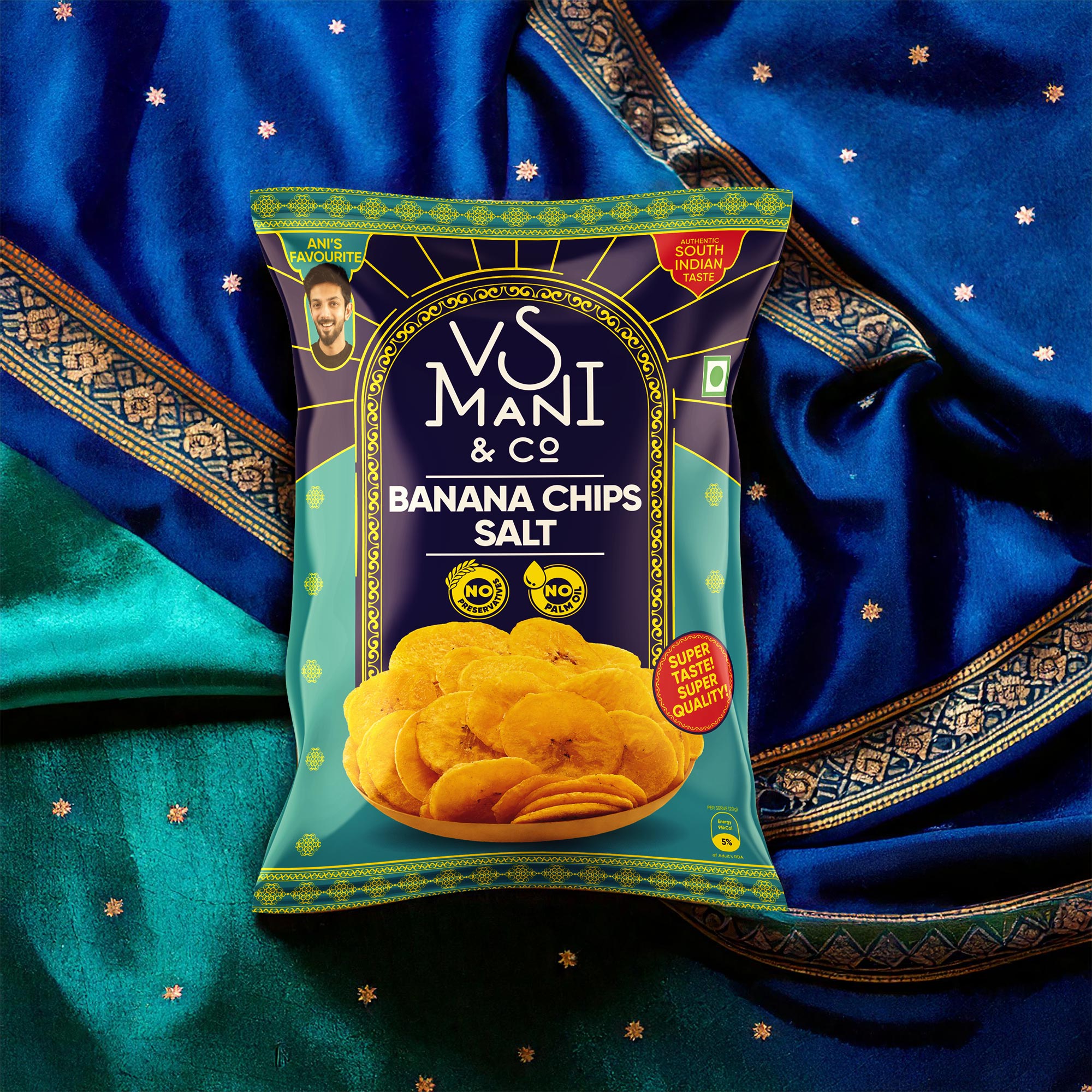
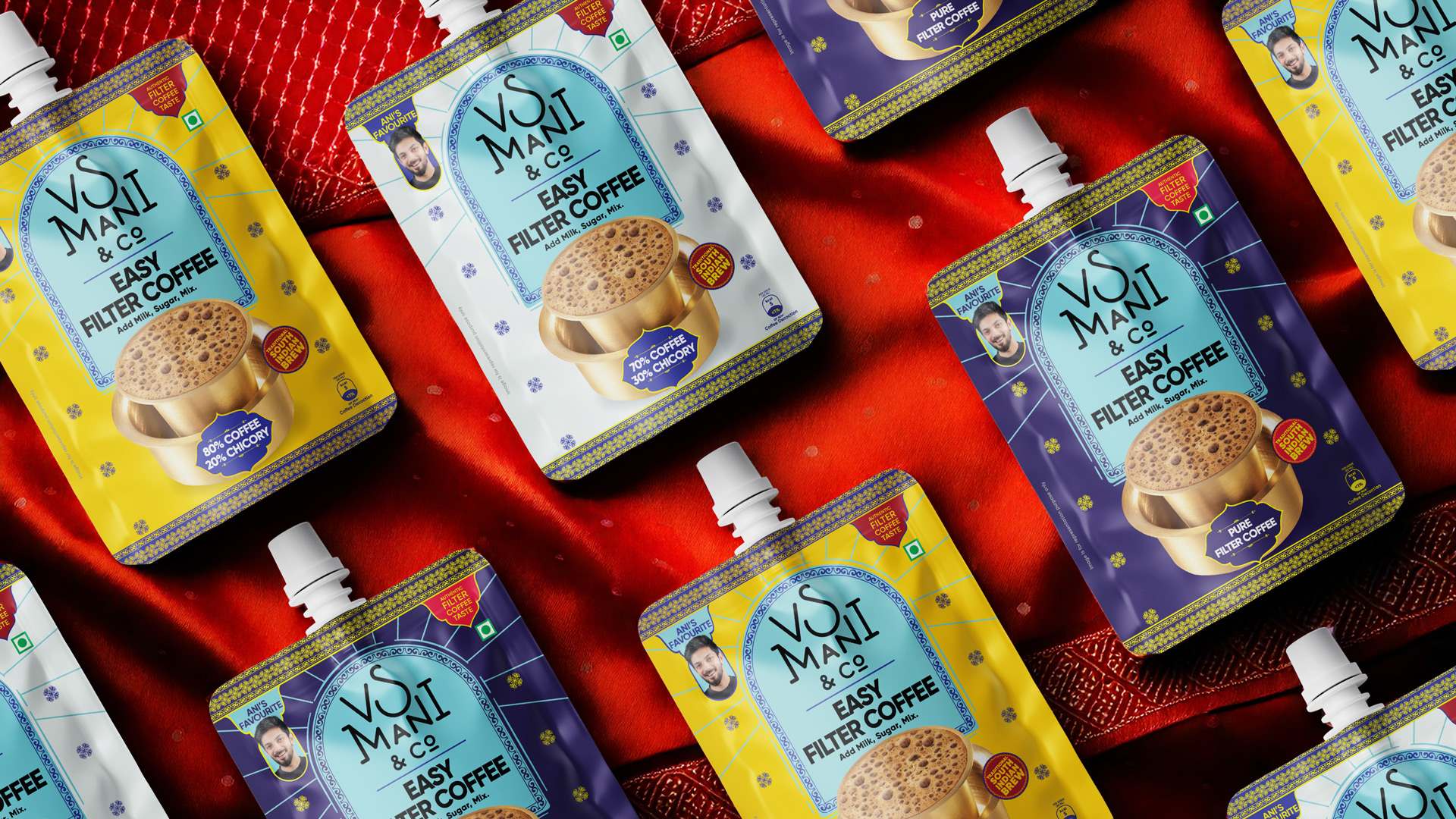
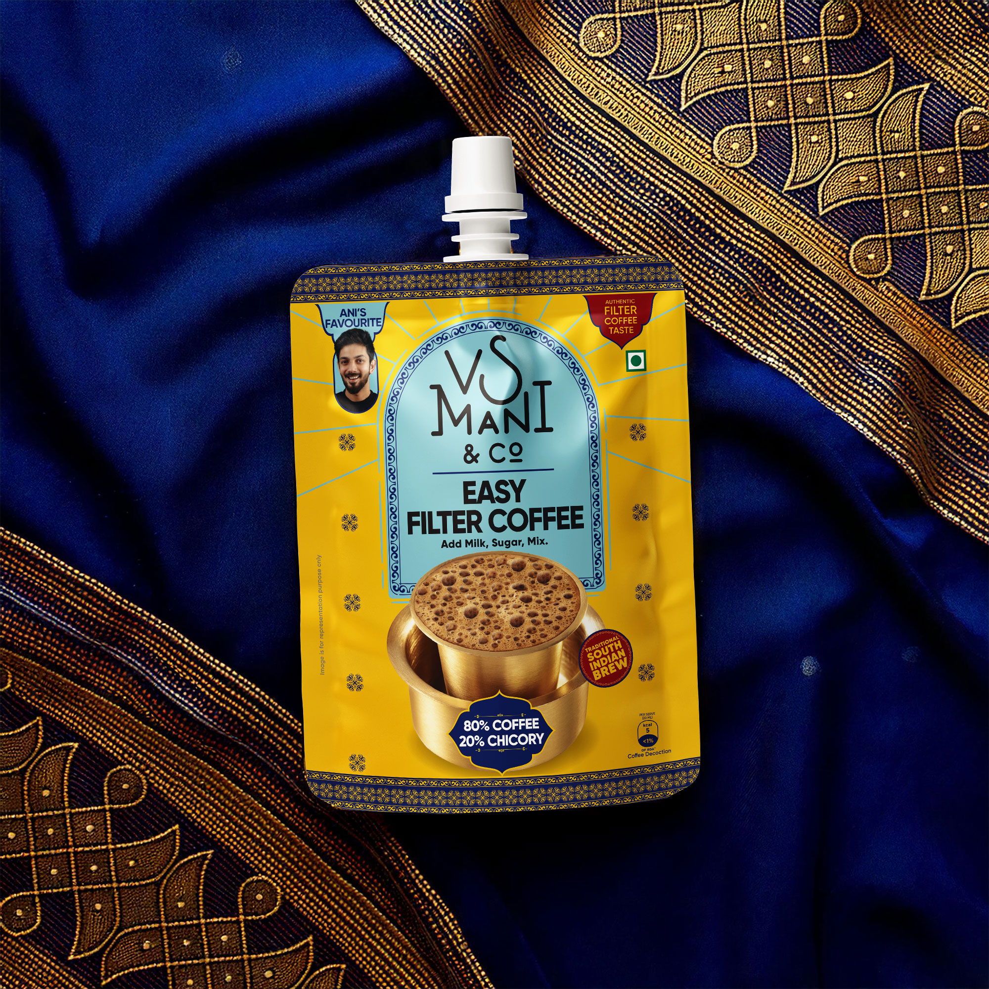
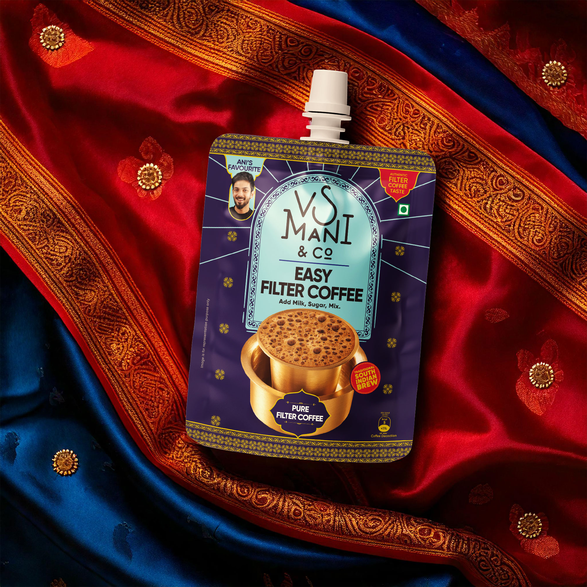
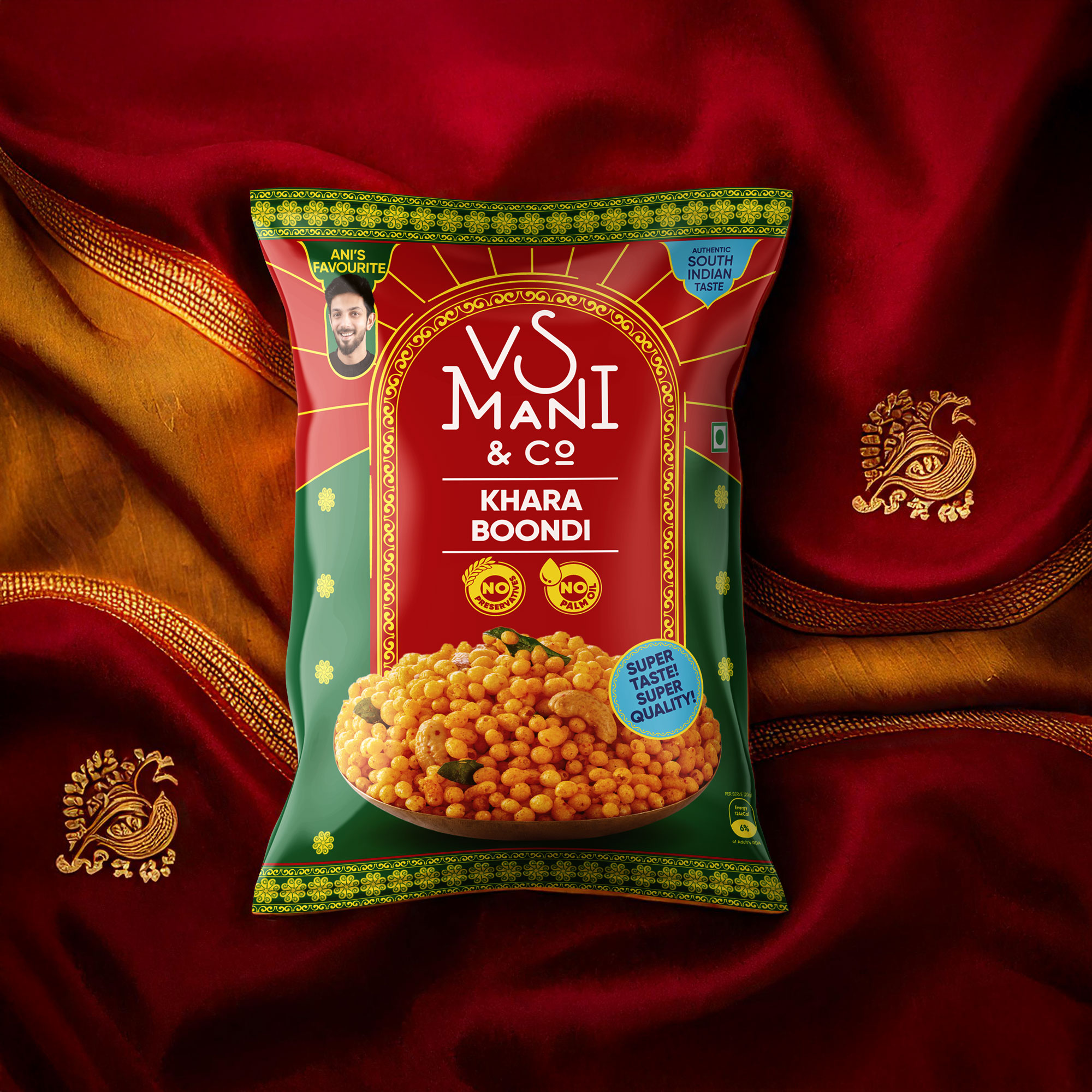
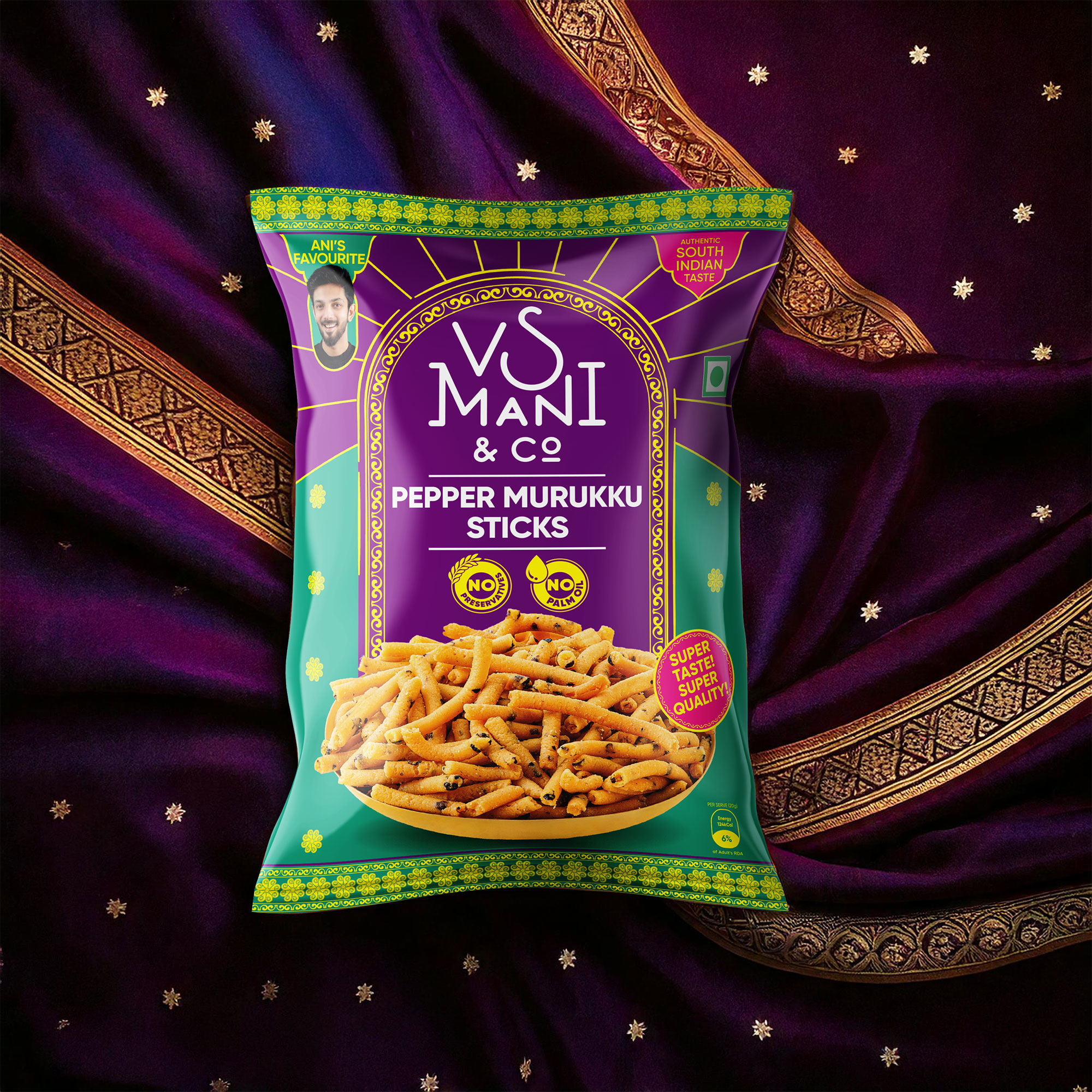
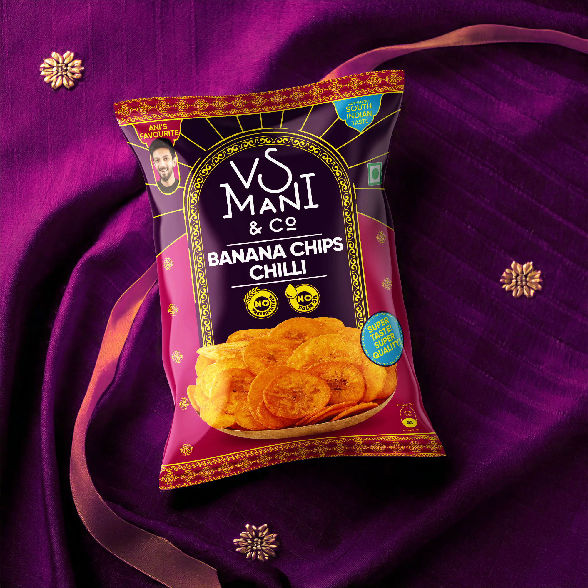
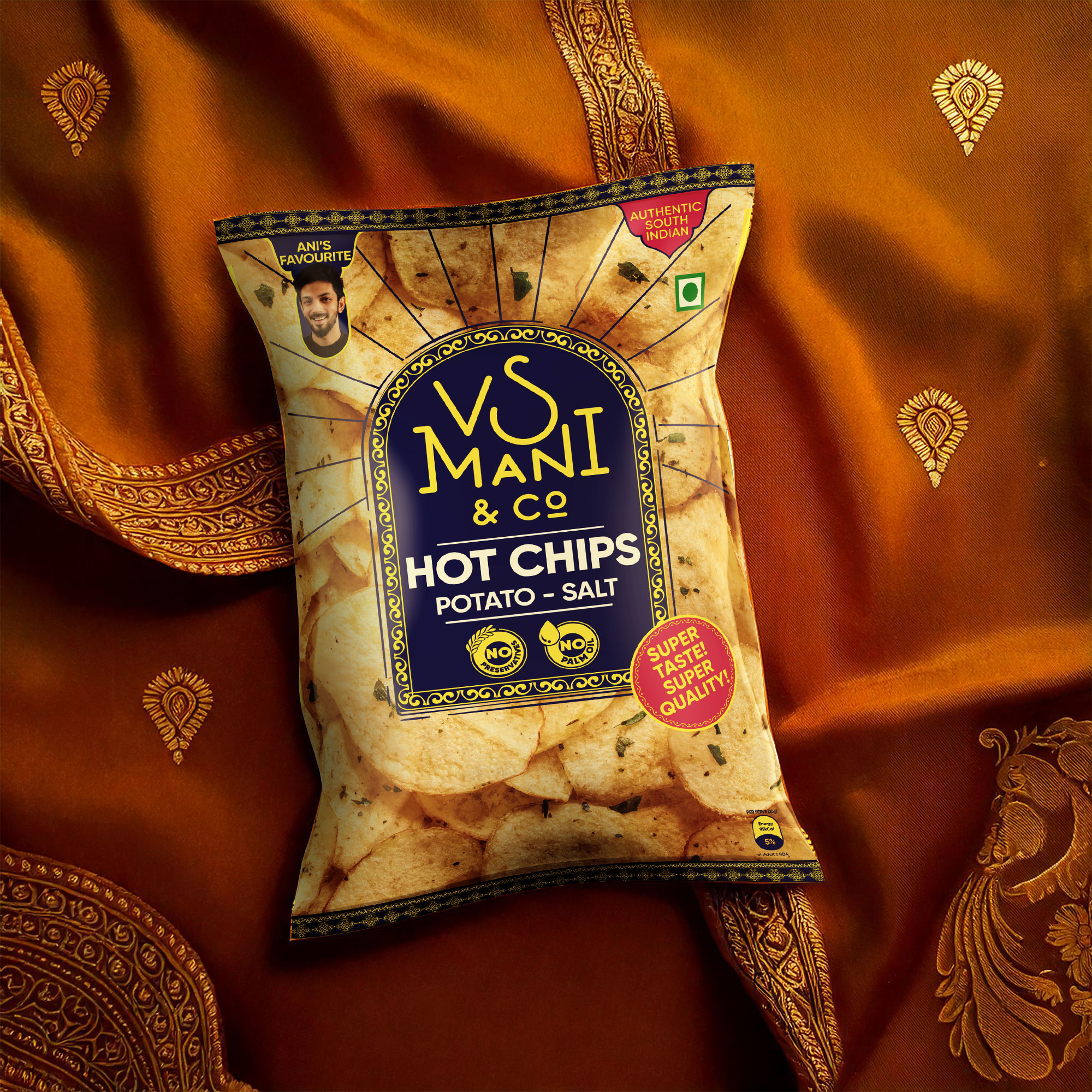
We were tasked with reimagining VS Mani & Co.’s packaging across their coffee and snack ranges—bringing cultural clarity without losing the brand’s minimal, modern feel.
Inspired by South Indian saree borders and temple tones, we introduced bold colour combos and subtle motifs that added depth, recall, and rootedness. The system bridges the gap between coffee and snacks, creating a cohesive identity that feels both familiar and fresh.
Tradition met design—quietly, confidently, and with a strong South Indian pulse.