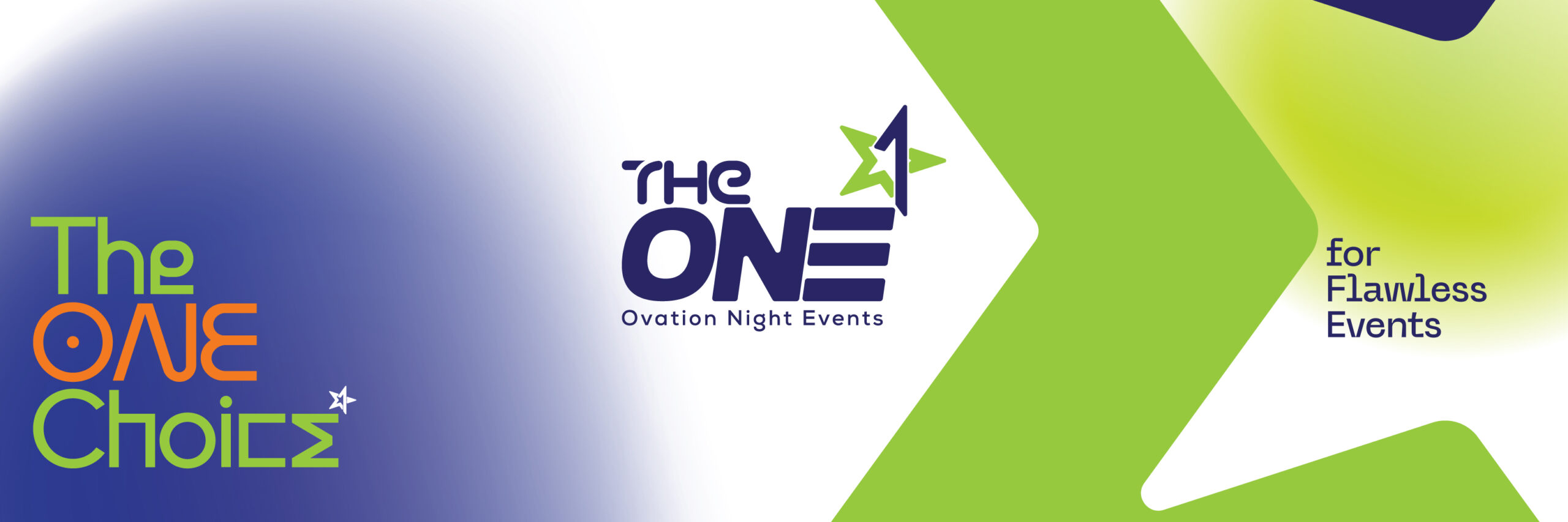
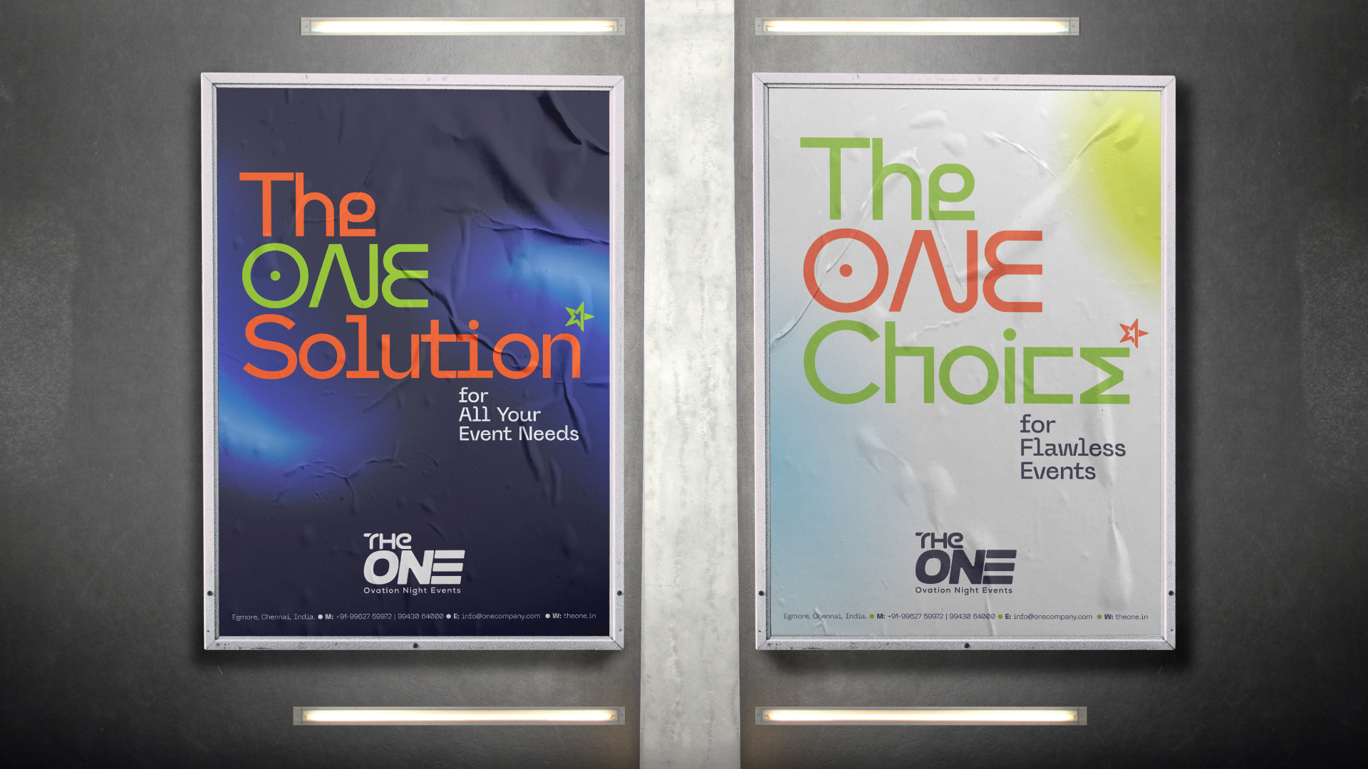
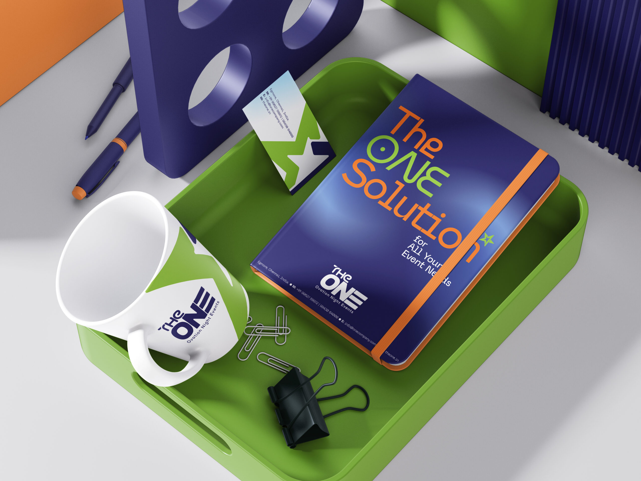
Some brands are built to fit in. The One was built to stand apart.
From the outset, the brief was clear: create an identity that felt aspirational but grounded, modern but timeless. Something that didn’t just look premium—but felt personal.
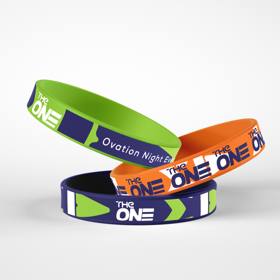
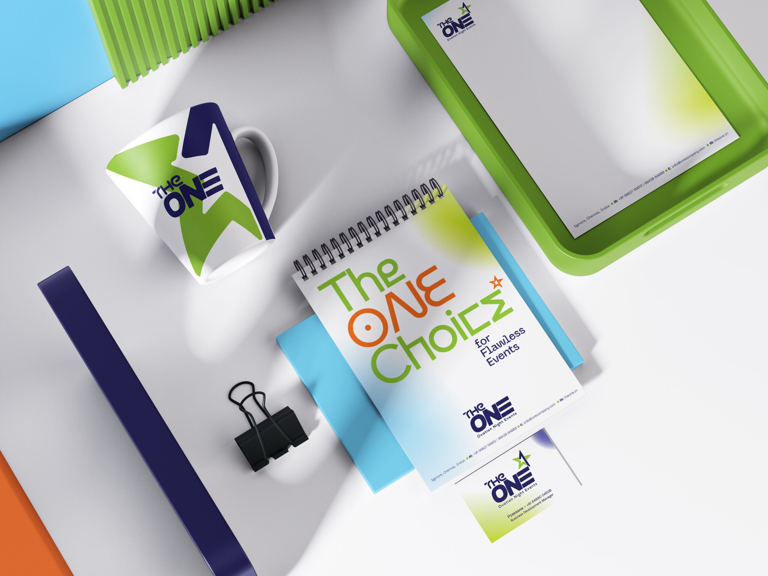
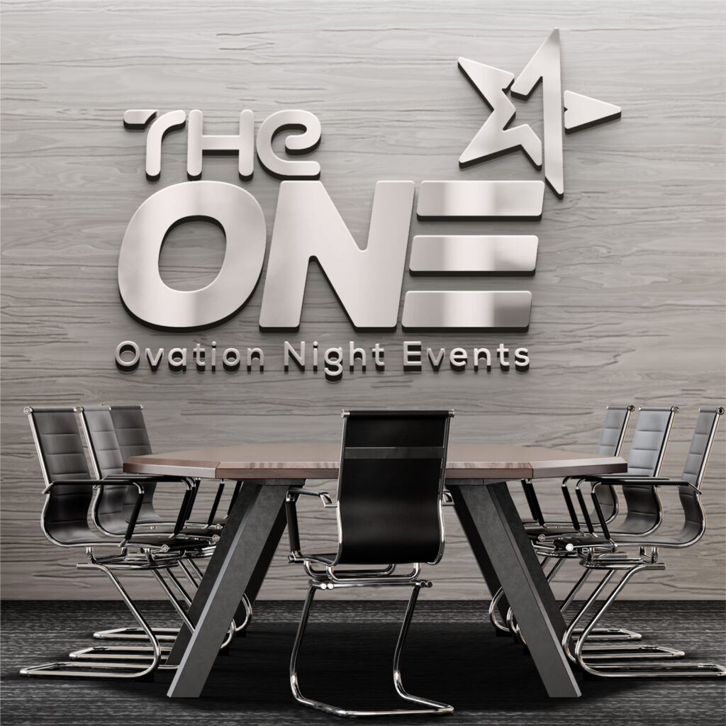
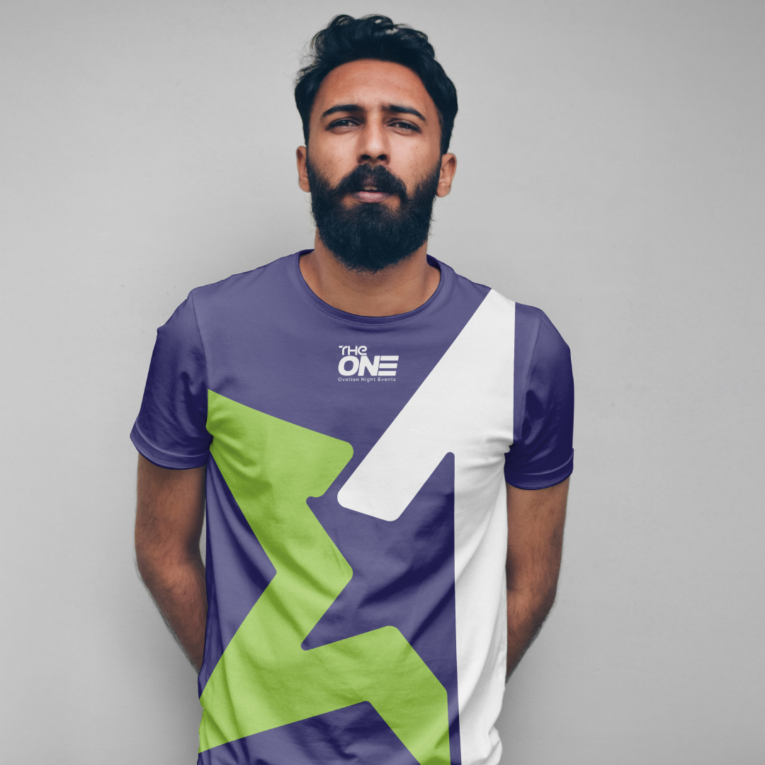
We started with the name itself. The One carries weight. It suggests clarity, confidence, and singular focus. The identity leaned into that energy—sharp typography, generous space, and a visual system that exudes quiet authority.