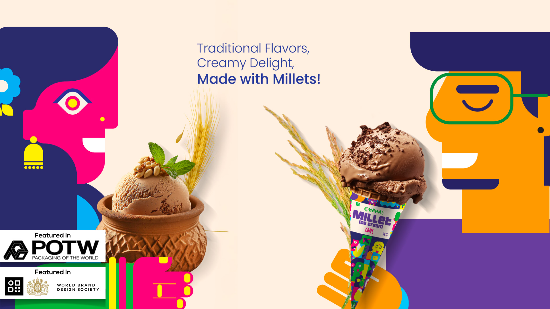
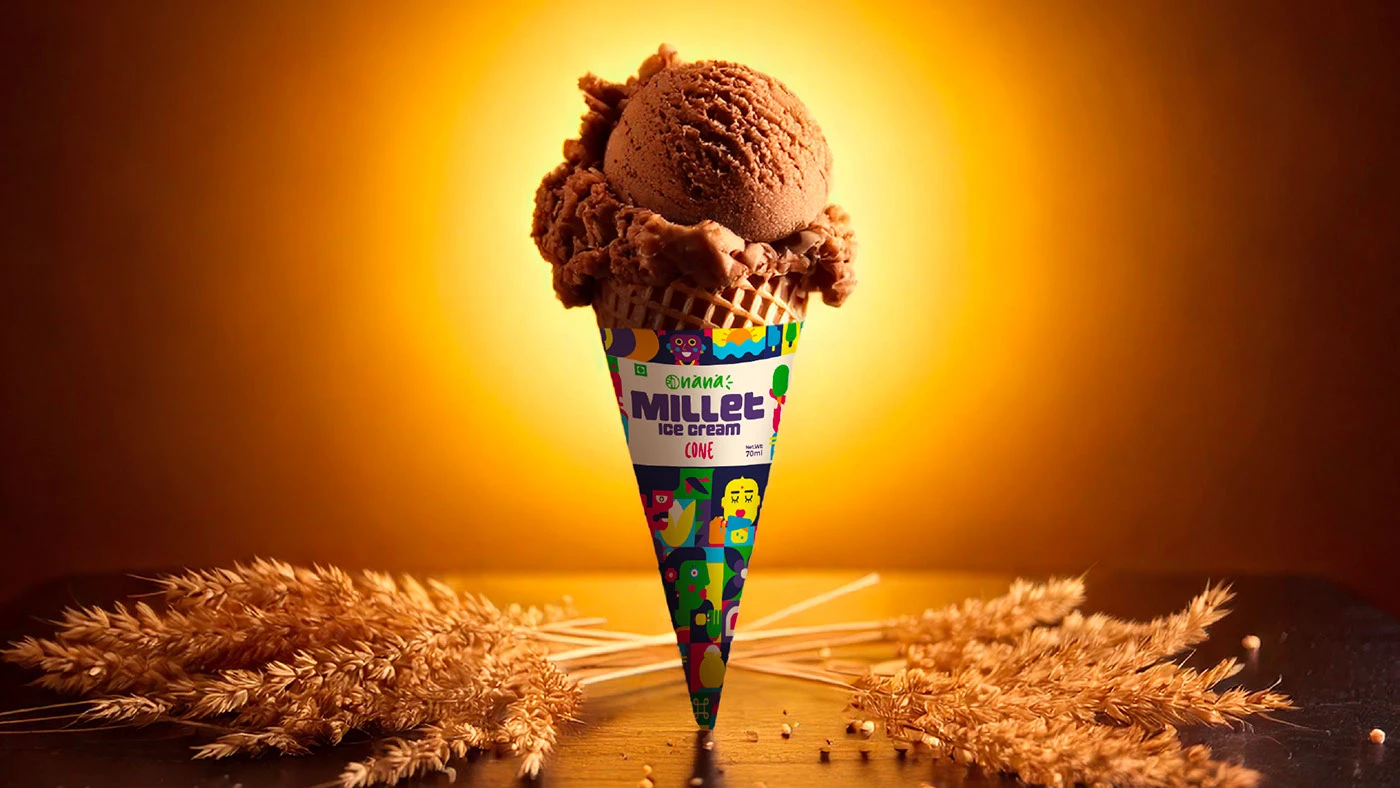
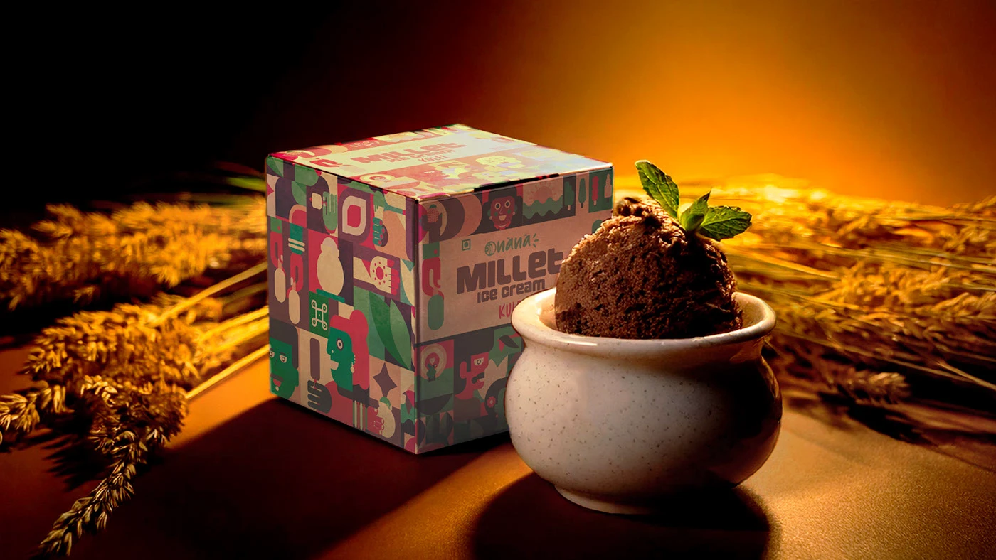
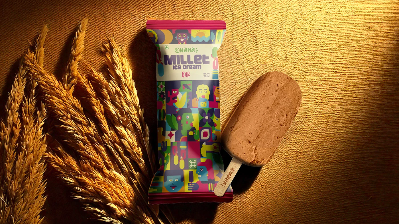
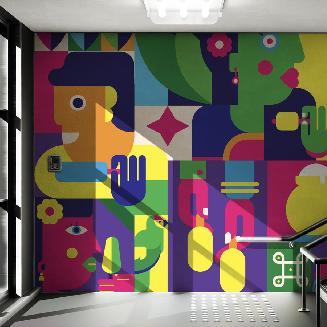
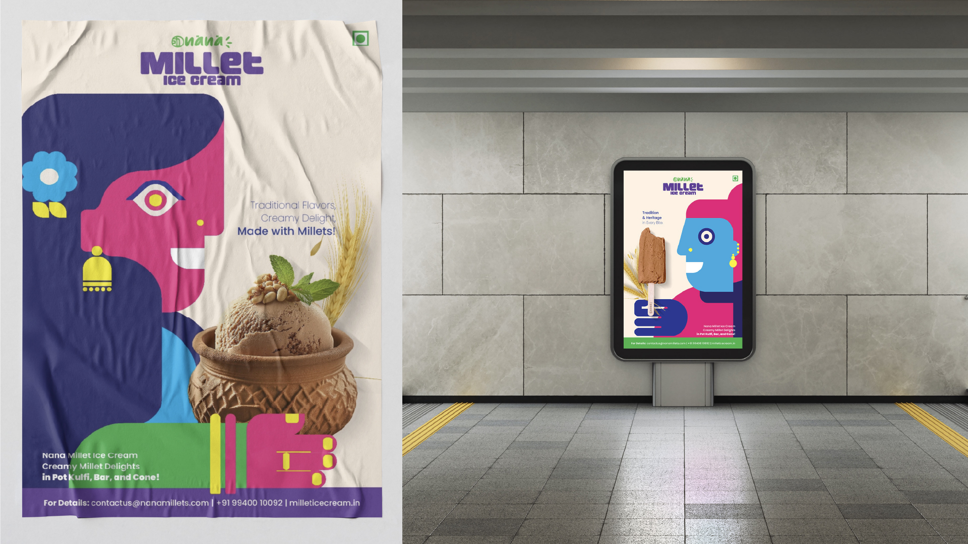
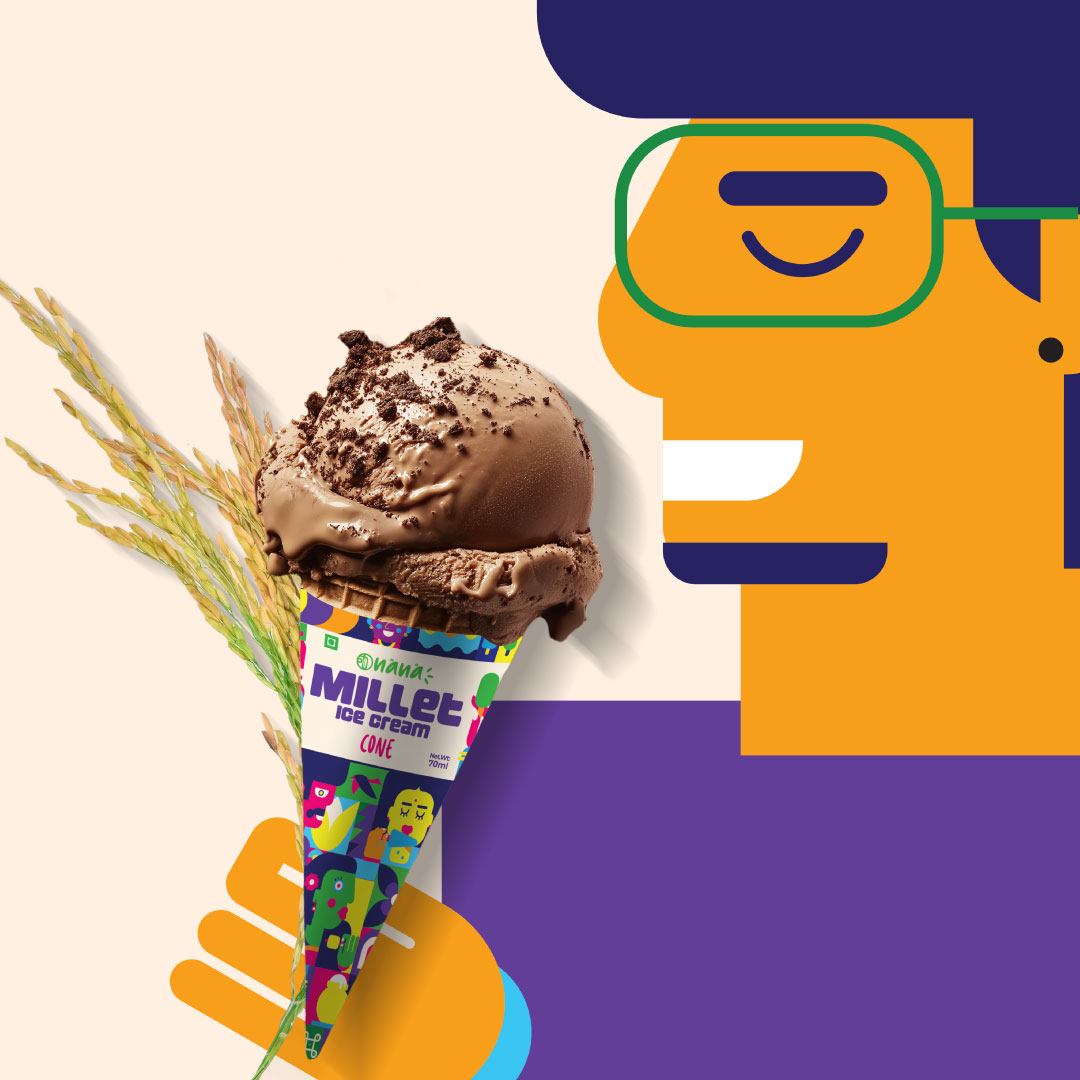
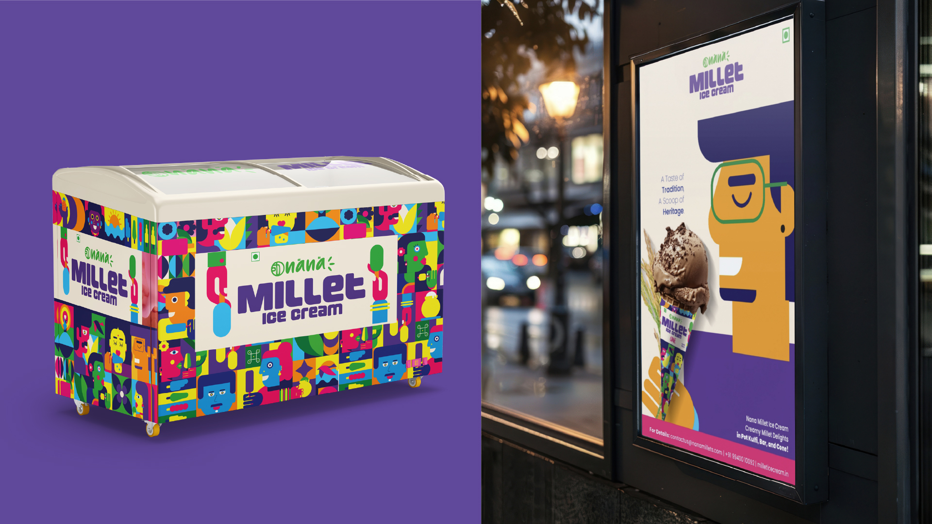
Nana’s millet-based ice cream needed packaging that felt traditional yet modern. We brought this to life through South Indian characters—playfully illustrated in a clean, global style. Inspired by saree borders, temple motifs, and everyday symbols like millets and earthen pots, the design balanced familiarity with freshness.
Vibrant colours and clear messaging like “Made with Millets” made the packs pop on shelves. The system worked seamlessly across cone, bar, and kulfi formats—appealing to both kids and adults.
What started as a niche product became a delightful, everyday treat—rooted in tradition, wrapped in charm.