A neighbourhood food brand with a million customers. And a brand that finally sounds like one.
உண்டு பசி தீர்ந்தும், அமுதினும் இனிதே — செய்கையின் நலம். — புறநானூறு
Even after hunger is gone, some foods feel sweeter than nectar — because of the goodness behind them. — Purananooru
The Brief
Nithya Amirtham has been feeding Chennai since it was one shop in Arumbakkam. Today it has multiple outlets across Chennai, Kanchipuram, and Tiruvallur — with a loyal customer base built on honest food and genuine warmth.
They came to Studio Kirukal for a complete brand identity redesign. Not to change who they were, but to build a brand that finally reflected it.
The Insight
We started by listening. To customers, to staff, to everyone who walks through the door on a regular Tuesday and everyone who shows up on a festival morning.
Everyone said the same thing.
Nithya Amirtham feels like home.
That became the brief we built from. Every touchpoint needed to feel the way the store feels — warm, colloquial, like someone who’s genuinely glad you walked in.
The Visual Identity
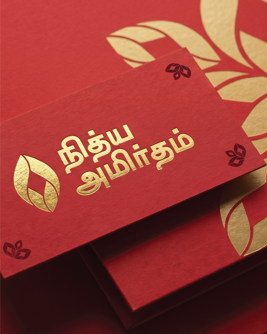
The brand already had a motif — a leaf form that had lived on packs and signage for years, quietly building recognition. We asked what it could become when given room.
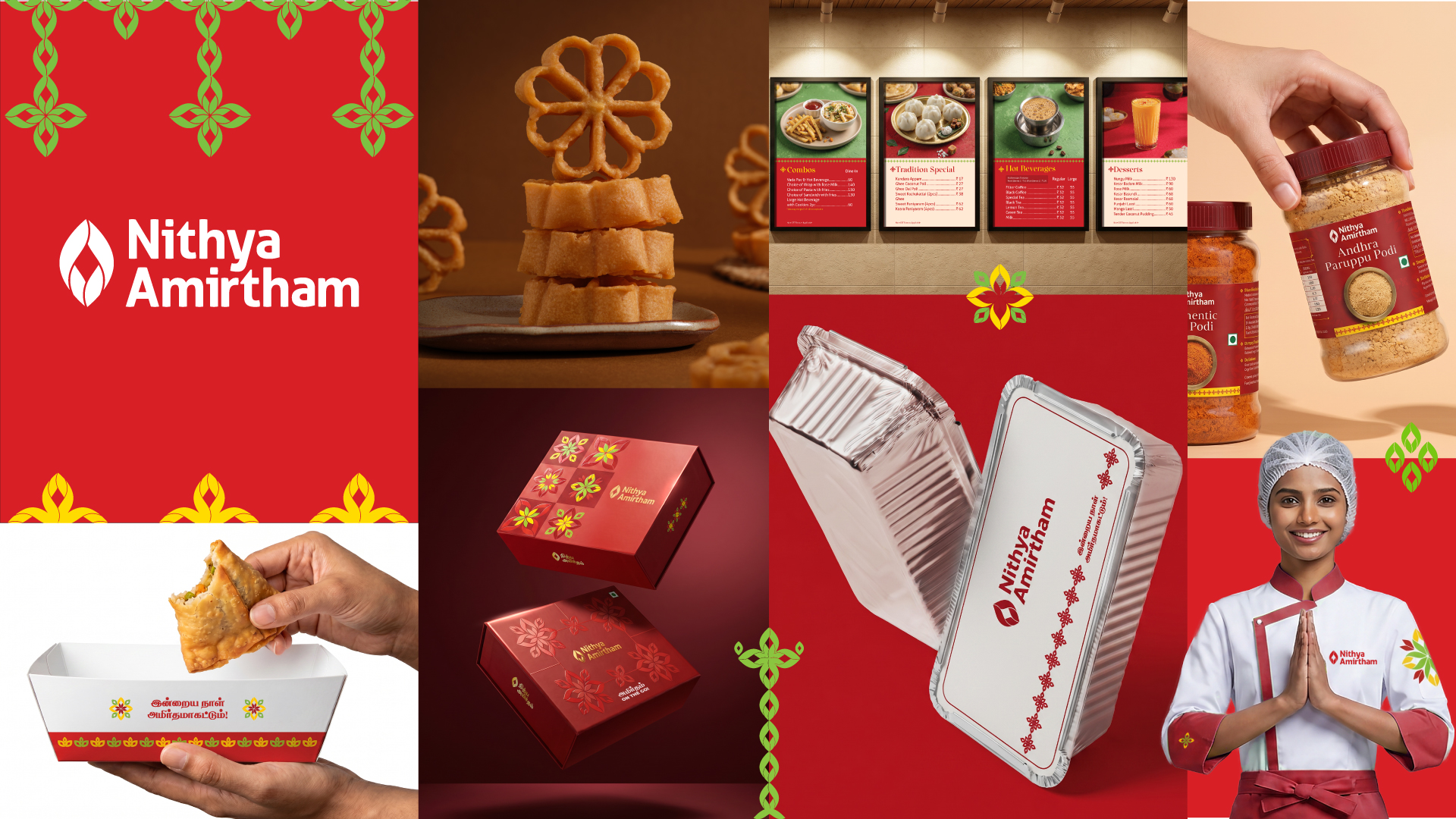
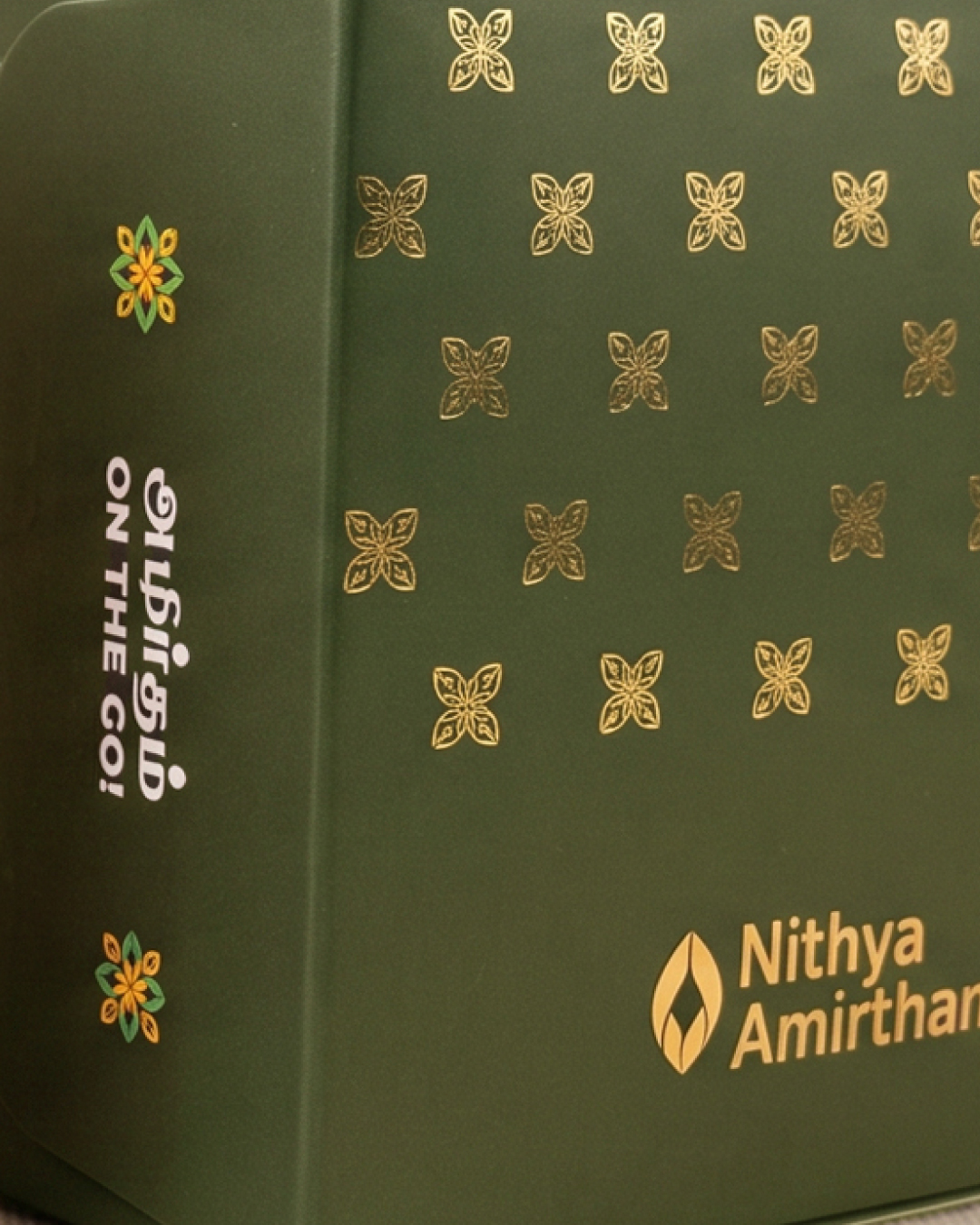
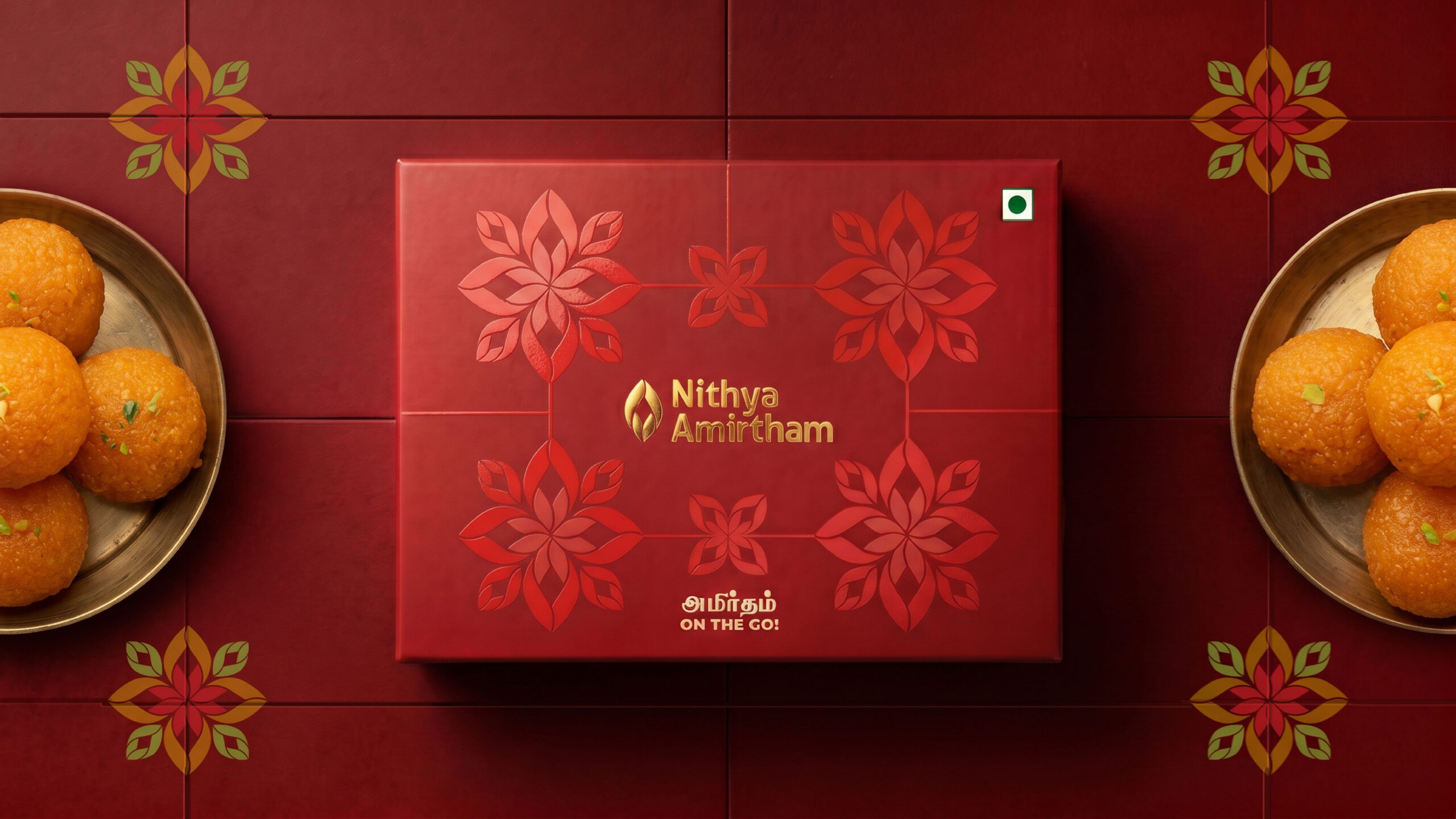
Four together form a flower. More together, a mandala. As a border it reads like a saree edge. Running across a surface, it becomes thoranam — the garland hung at a doorway to say welcome. The rhythm of a saanthu kolam. Textures Tamil households already live with.
We didn’t bring a pattern in from outside. We grew one from what was already there.
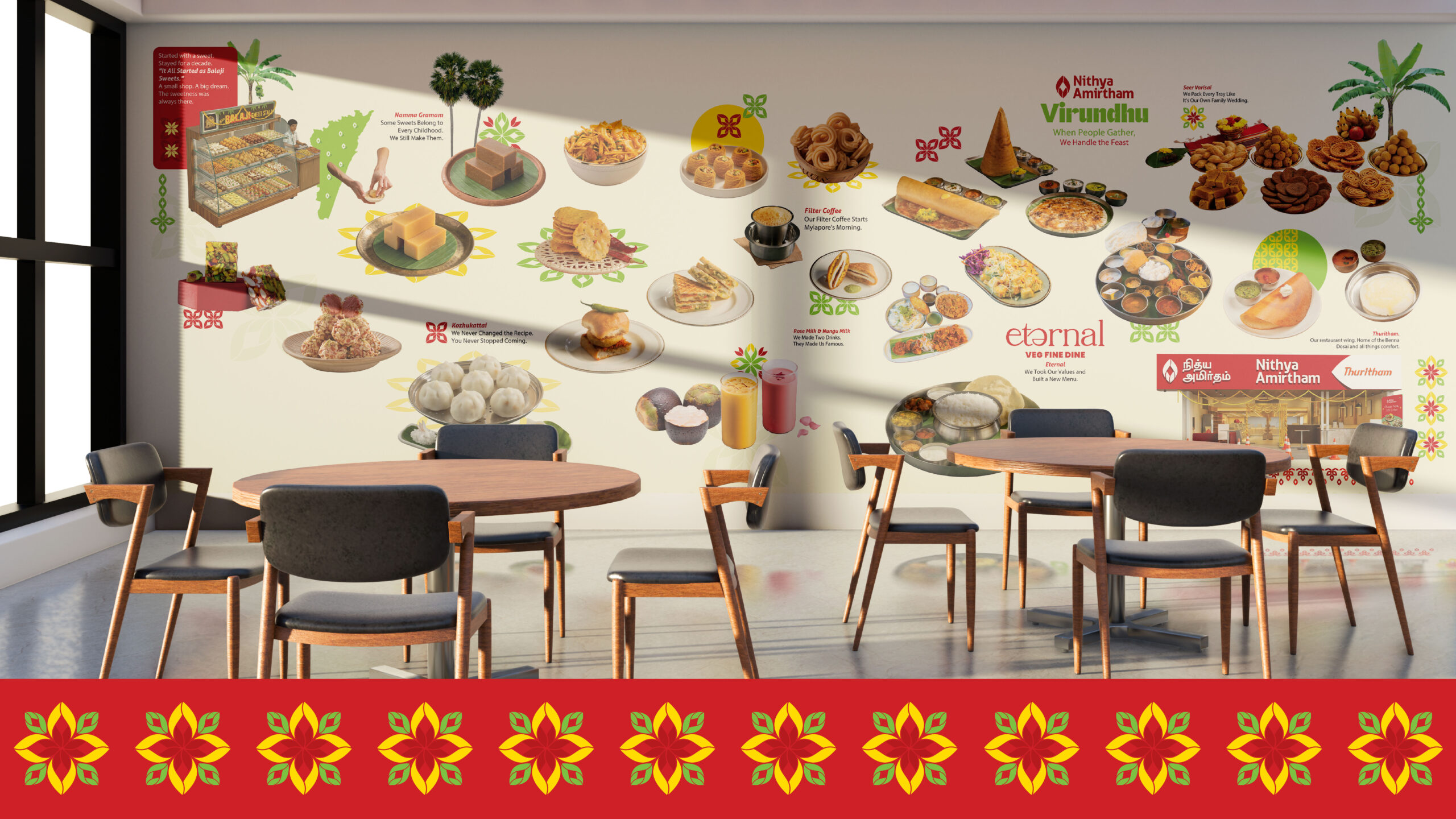
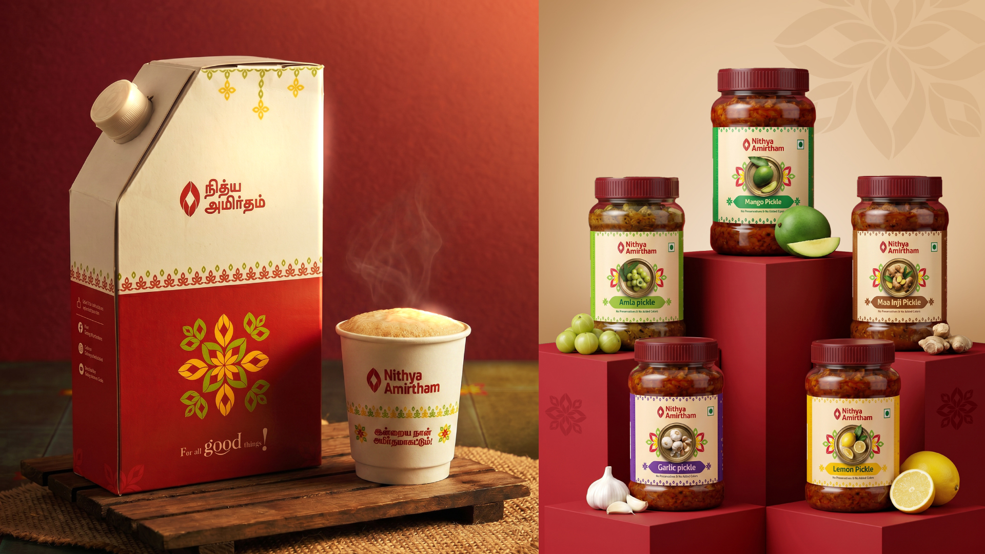
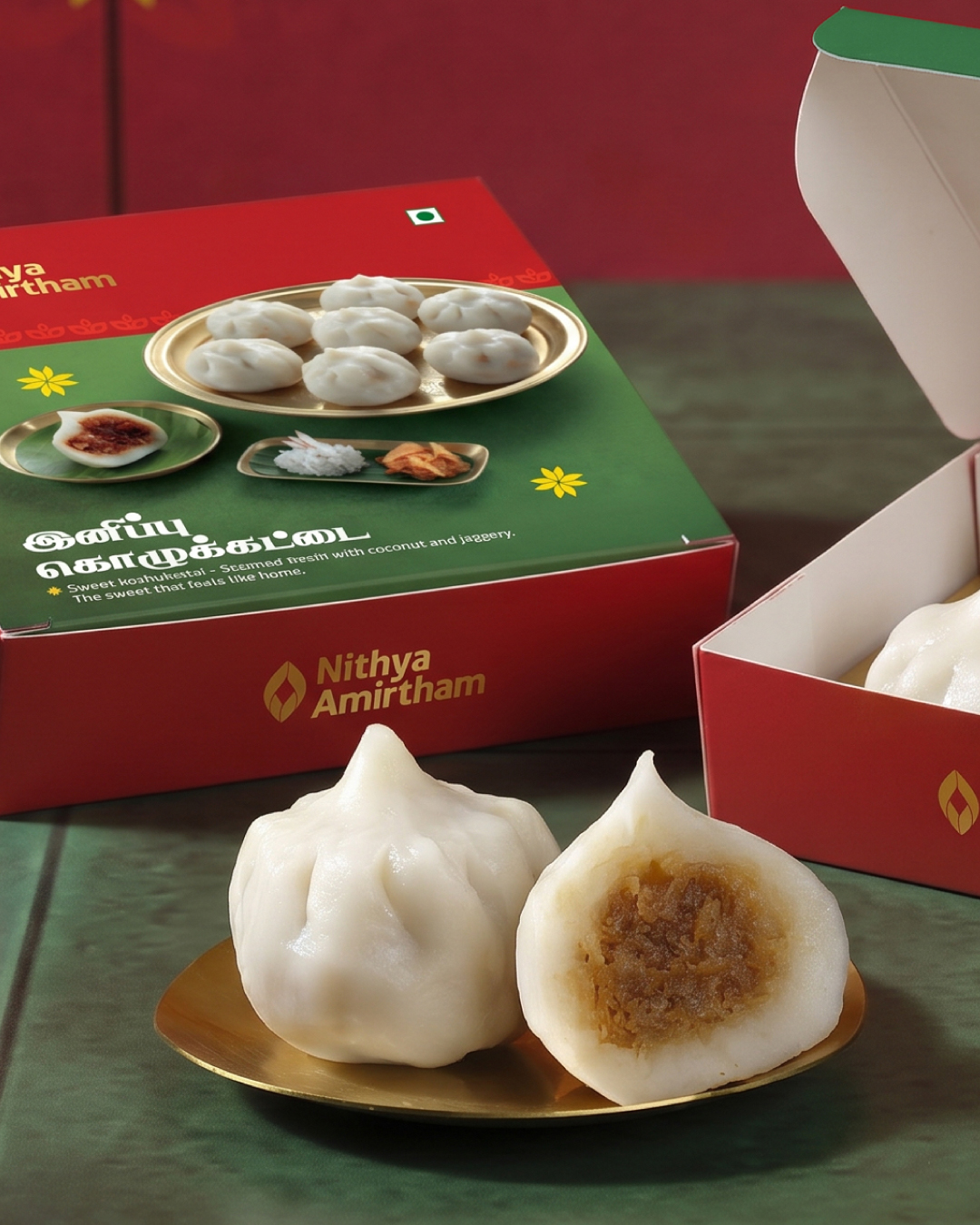
That pattern now lives across every takeaway box, every pack, every uniform, every surface — from their Chennai outlets to Kanchipuram and Tiruvallur. A visual identity system rooted in Tamil cultural memory, built to scale.
The Brand Language
This is where the real shift happened.
“Shall we pack a laddu for you?” “Feeling snacky? Shall I pack a Madras Mixture?” “Have you tried our Sweet Kozhukattai today? If not, try. If yes — share it with others.”
That “shall I.” That “shall we.” That’s not a tagline. That’s the person behind the counter — the one who’s genuinely glad you walked in.
The Tamil voice runs parallel, not translated.
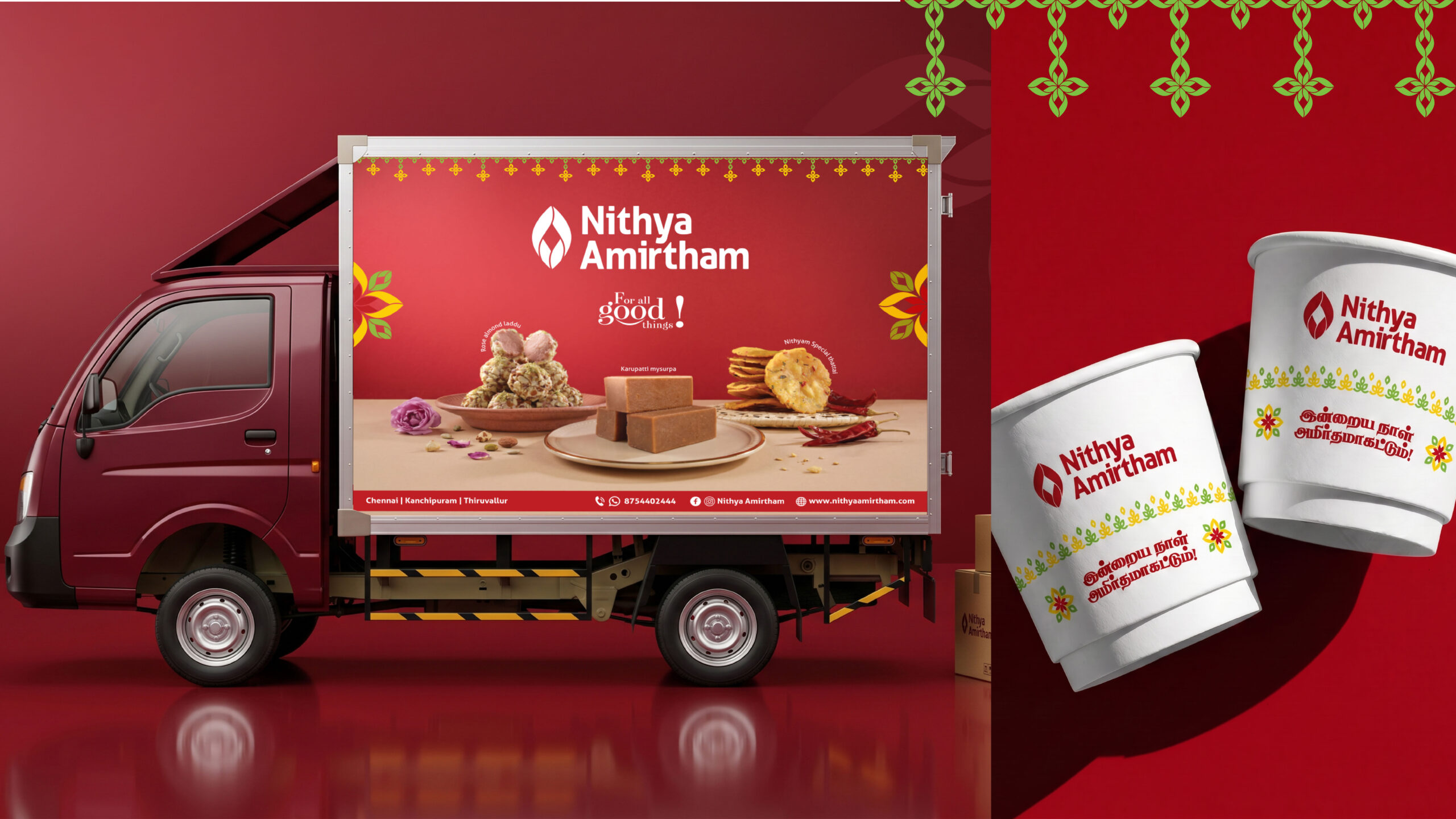
இன்றைய நாள் அமிர்தமாகட்டும்!
May today be amirtham. On every cup, every box, every card that goes home with a customer. Not a slogan. A blessing.
Both languages. Same warmth. The brand finally speaking as one.
The Doorway
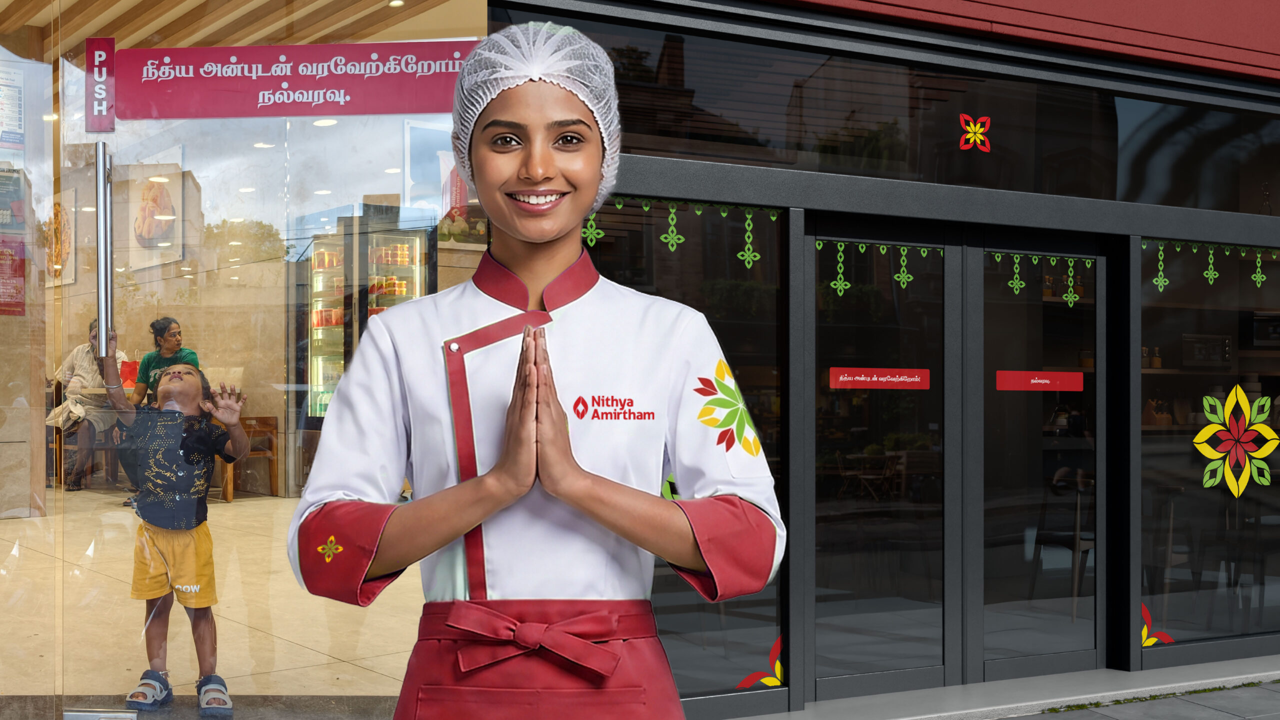
Walking in — நித்திய அன்புடன் வரவேற்கிறோம். நல்வரவு.
Walking out — இன்றைய நாள் அமிர்தமாகட்டும். நன்றி மீண்டும் வருக.
Above both — the motif, hanging from the top of the frame like a thoranam.
What We Delivered
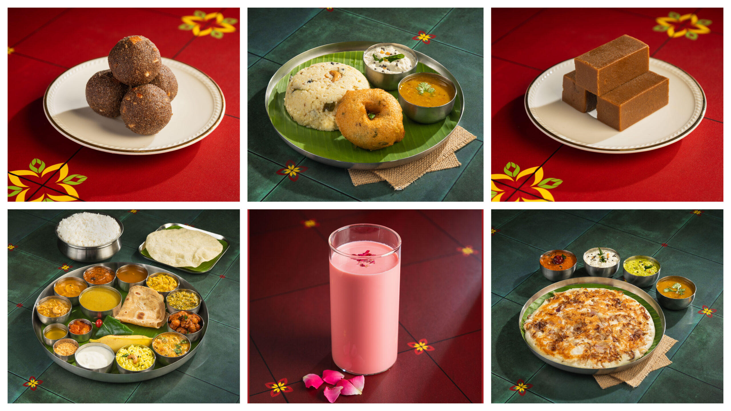
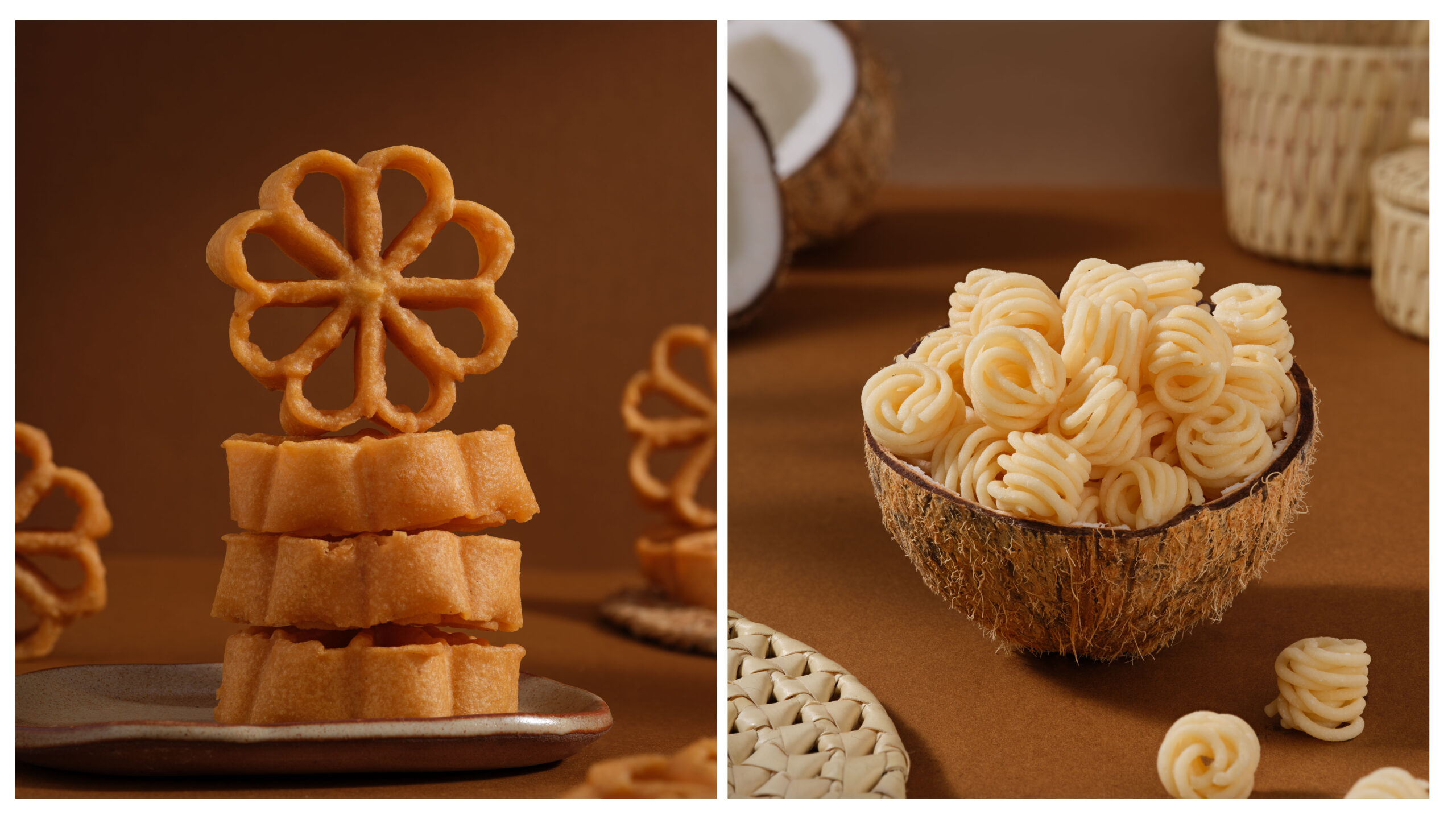
Brand identity redesign · Logo refinement · Tamil and English typesetting · Colour system · Pattern library · Brand voice guidelines · Packaging design · Stationery · Staff uniforms · In-store signage · Menu design · Social media templates · Brand guidelines document · Product Photoshoot · Swiggy/Zomato Catalogue redesign
The Result
A neighbourhood brand doesn’t need a tagline. It needs to mean it — every time someone walks in, and every time they leave.
Nithya Amirtham always meant it. Now it finally sounds like it.