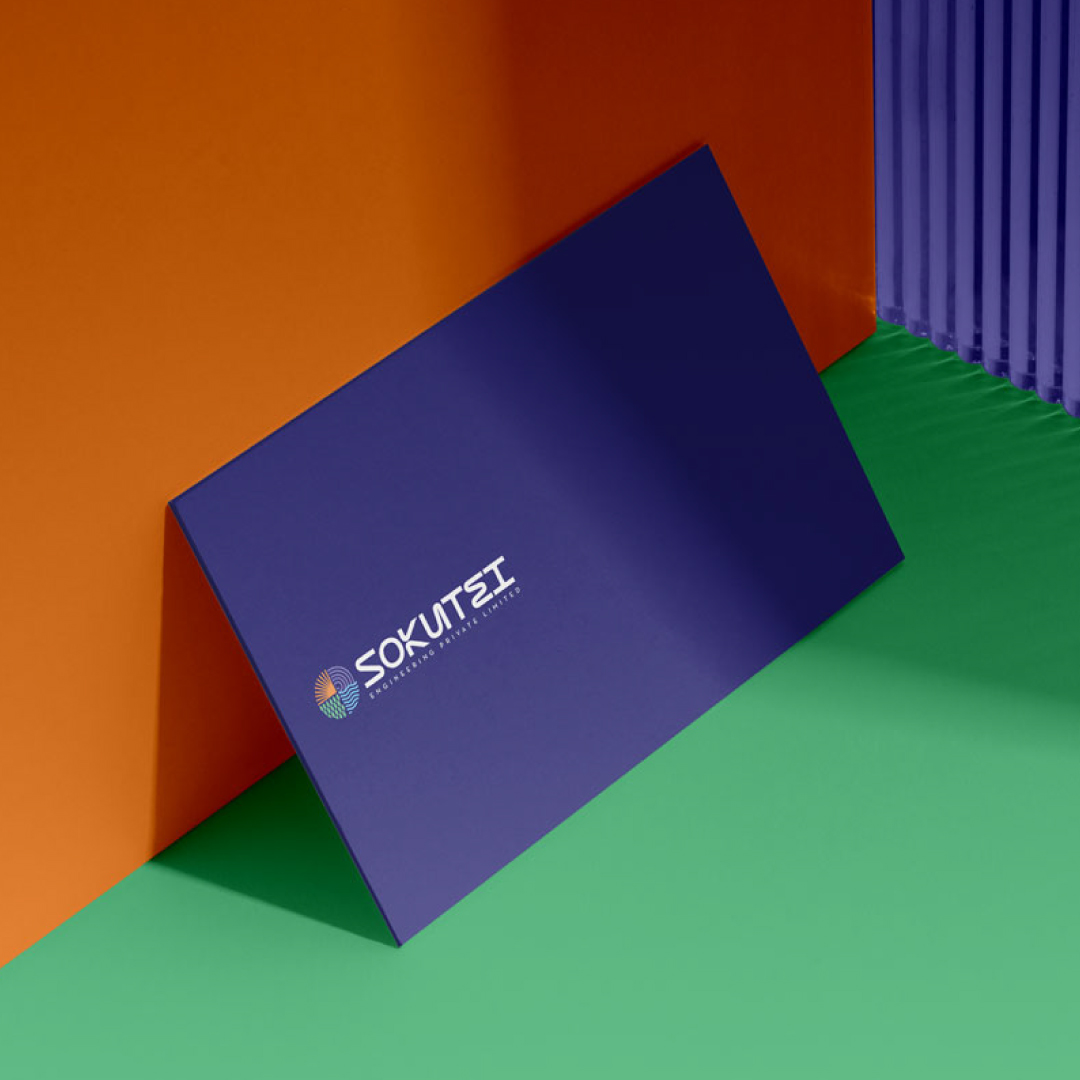
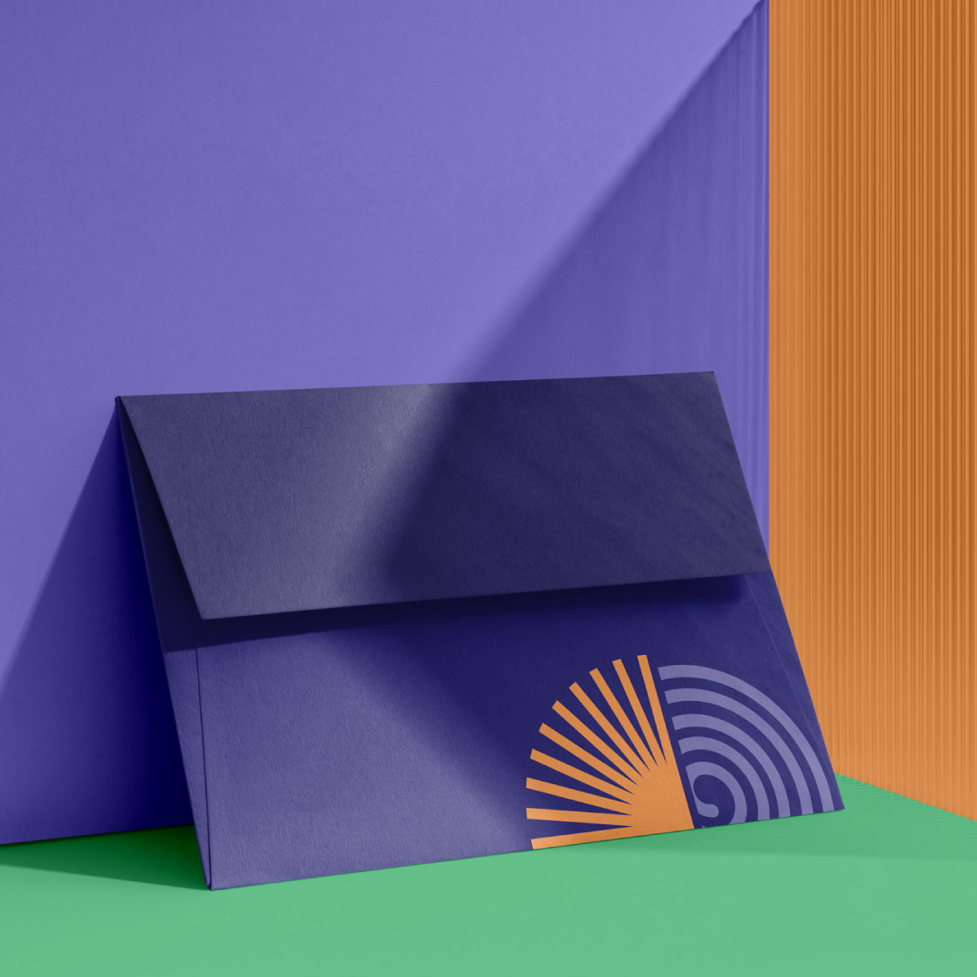
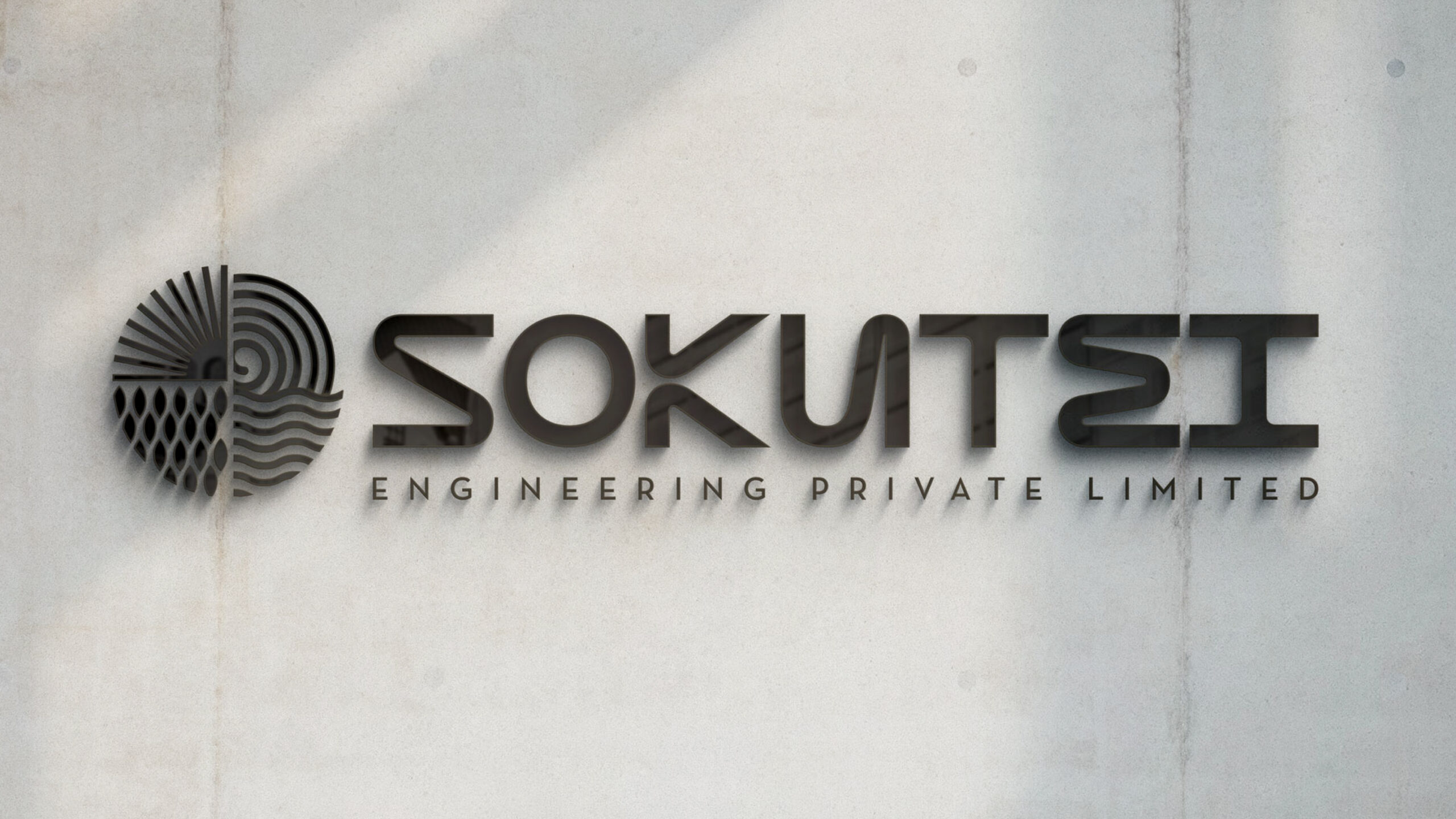
We were tasked with building an identity that reflected a sharp, measured approach to problem-solving. The name itself—Sokutei (meaning “measurement” in Japanese)—became the starting point for a visual language rooted in structure, calm, and focus.
The design system used fine lines, clean type, and intentional spacing—mirroring the brand’s attention to detail. The tone was minimal but assertive. No noise. Just signal.
In a world full of clutter, Sokutei stands for balance—measured, modern, and unmistakably clear.